The New Media Blog is coming to you from the canals of Amsterdam this week, as I’m attending PICNIC, a 3-day, cross-media conference. The city is bustling with activities relating to or revolving around the conference, which begins tomorrow, but today I’m enjoying non-conference tranquility and find myself returning to a place I discovered one year ago. Back then it was brand new and I instantly fell in love with it: the Amsterdam Public Library.
Libraries are wonderful places IMHO. Besides being full of lovely media, they are full of real people inhabiting the city. I often seek out city libraries when visiting other parts of the world just to get a feel of the place. As centers of knowledge they somehow mirror the creative and curious outlook of the city and tell you a lot about the attitude of its citizens.
Some are of course more wonderful than others and I can only encourage anyone visiting Amsterdam to swing by the Openbare Bibliotheek Amsterdam (OBA) for look at a modern, well-balanced and user-friendly library. Just like the city itself – how about that!
It’s tempting to bore you with facts of its impressive scale and services but let’s just suffice to say that OBA is the largest public library in Europe and has 600 Mac/PC workstations among its 1000+ seats besides solid WiFi coverage. Wow.
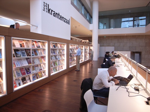
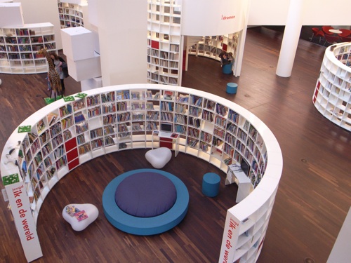
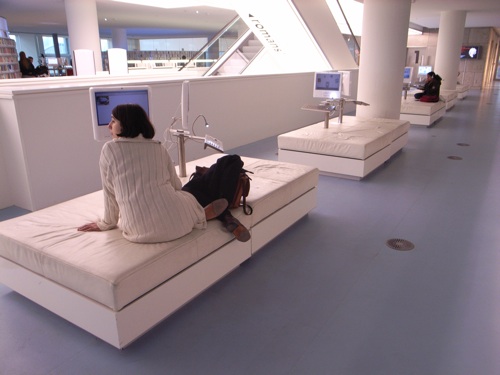
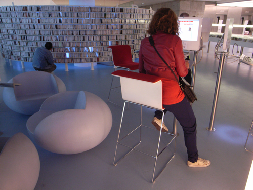
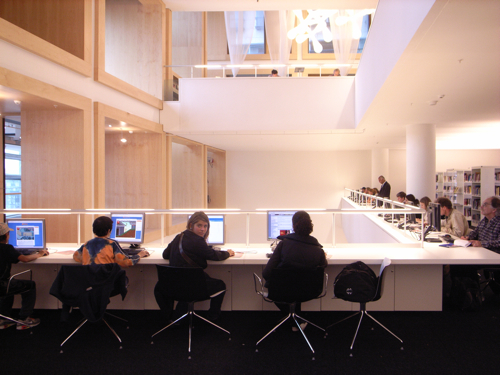
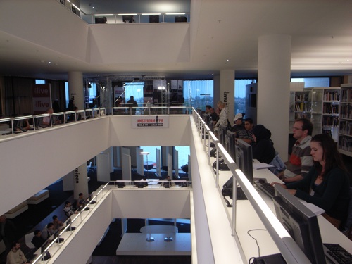
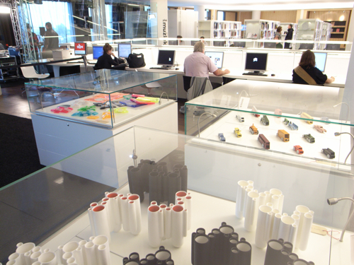
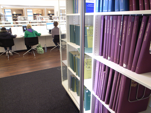
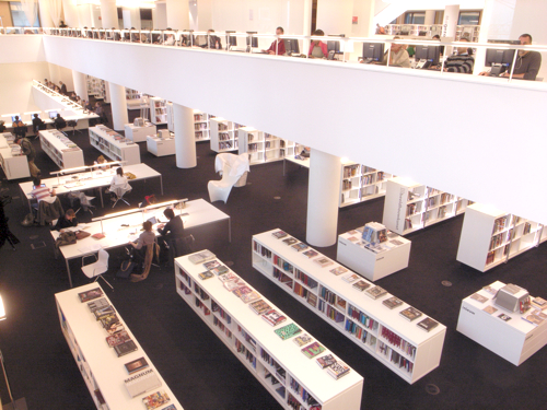
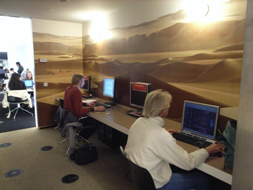
It’s also tempting to bore you with my overly amorous musings about media, architecture and space for play, but instead I’ve decided to take some holiday snapshots of OBA interior. They don’t do it justice, but still I hope to purvey a sense of how this library does more than books – more than media even.
Maybe I’m blinded by library love here, but it truly seems to me that OBA succeeds in bridging the gaps between old media, new media and the users. On every one of its 10 spacious floors, books are as much a part of the interior design as they are media bits. Computers are not hidden away in bulky booths but put in the foreground and arranged imaginatively around the library. Users are not customers, but guests lounging everywhere and truly putting the library to use. The interior of the library balances on a fine edge between stylish minimalism and kindergarten playfulness and it’s mostly pulled of nicely.
The ongoing debate on the future of libraries in a world of digitized content is not in any way irrelevant. We need libraries to inspire future generations, but in a world of many media outlets going increasingly mobile, it’s time to think hard about how you frame the media on display and make it inspiring instead of awkward.
Situated on the Amsterdam waterfront-in-progress, overlooking the city and the passing canal boats, OBA with its multitude of activities and spaces for personal immersion provides a highly appropriate and much sought after frame for all its media-on-offer. The library becomes the medium of inspiration.
Did I mention I’m an avid fan? Here are some pics with mouse-over caption.


