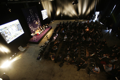
Jonathan Harris is showing Danish media pros the awe inspiring We Feel Fine project that visualizes feelings expressed in the worldwide blogosphere. As long as a sentence has “I feel” in it, it is picked up by Harris’ service. Beautiful visualizations, great filtering possibilities for targeted feeling-browsing. Crowd enjoying it.
We Feel Fine really provides a unique and inherently compasionate view of the way people use the internet. It’s also a great insight tool if you’re interested in human behaviour and psychology. Some statistics pulled from the project:
– Apparently Danish bloggers feel 13 times more “sure” of ourselves than average.
– Christmas Day is statistically the day when most happy feelings are expressed.
– Sunday is by far the happiest day of the week. Wednesday is the least happy day.

Linking to the previous talk by Weinberger, We Feel Fine provides valuable metadata and doesn’t try to control the content. By pulling simple information from the blogosphere, dots of feelings are connected. Miscellaneous feelings become intelligent connections across time and space. We Feel Fine makes you feel that you’re part of a bigger picture.
Really, We Feel Fine cannot be retold in words. Jonathan is now showing us some of the other brilliant human-data visualization projects he’s doing, but until the conference webcast is put online but Jonathan has asked us to not record and distribute the presentation – instead you should watch the short version from TED:
We Feel Fine project presented by Jonathan Harris at TED.
Read More:
Data Visualization: Is it the future of the internet?


