This year we decided it was time to walk-some-talk and go for a serious redesign of both our visual identity and website (we’re sure some of you agree.)
Rest assured however, that the conference crew and content is just as focused on new media innovation as it ever was – and as of today we’re open for conference registration too. This year our venue will be Copenhagen’s new pride; Jean Nouvel’s Concert Hall in DR Byen.
We’re very excited to finally show you what we’ve been creating for the past months here at newmediadays.dk. The basic premise of our rebuild was to honor the 5 years of knowledge springing from past New Media Days. So we designed our archives to be intuitively searchable, facilitating our video material the best way possible.
Together with the blog – this alternating stream of conference news and linked arguments – and the conference part of the website, we hope that our visitors take some time to explore the flavor of New Media Days.
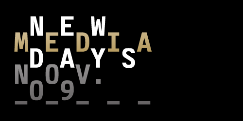
The great people behind our tasty new design are e-Types. Here’s what they have to say about the design:
“Like NMD we love new media. From being utter print nerds, scorning this thing they called “the internets,” e-Types has over the years embraced all things web-ish. And really, tech stuff aside, there is not that much of a stretch from designing for paper to designing for bits and pixels. In the end, its about new ways of seeing, communicating, sharing and creating.”
“Designing the website and identity, we wanted to reflect not only the mentality of the people who work around the clock to put the conference together, but also the mentality of the web itself. Dynamic and ever-changing, abstract and playful, the logo was designed to be hacked, pulled apart, mutated and remixed – because we believe it is in the mix of cultures, minds and ideas the true value of the internet is to be found. Potentially world-changing, definitely mind-altering NMD is truly golden!”
So there you have it: As much as we like latte, our new conference identity color is really GOLD! If you’re not quite convinced, secure your ticket for New Media Days 2009 and be prepared for showers of really sparkling Pantone colors. And exceptionally fantastic speakers! And some latte.
As with all things web, our site has built in room for improvement and we have plenty of nifty features scheduled ahead. Please don’t hesitate to comment on our flaws or fabulousness – here on the blog, on twitter, facebook or by good old e-mail


